JACK PH (Junior Academy for Coding Knowledge) — Brand Refresh & Visual System Study
Project Type: Brand Identity, Visual System, Marketing Assets
Role: Creative Direction, Branding, Visual Design
Year: 2019
Industry: Education / Coding for Kids
OVERVIEW
JACK PH (Junior Academy for Coding Knowledge) is an educational institution focused on equipping young students with foundational coding skills and digital literacy.
This project is a conceptual rebrand study exploring how the brand could be refined to better reflect its mission of empowering young innovators through technology and hands-on learning.
The focus was on strengthening visual consistency and creating a more cohesive system across brand
THE CHALLENGE
While JACK PH has a strong mission and clear educational value, its visual identity had opportunities for improvement in terms of consistency and scalability.
The existing assets lacked a unified system that could support different touchpoints while maintaining a clear and recognizable brand presence.
THE GOAL
To explore a refined visual direction that:
Strengthens brand consistency across materials
Better reflects innovation, learning, and creativity
Feels engaging and approachable for a younger audience
Provides a clearer system for future brand applications
SCOPE OF WORK
What I worked on:
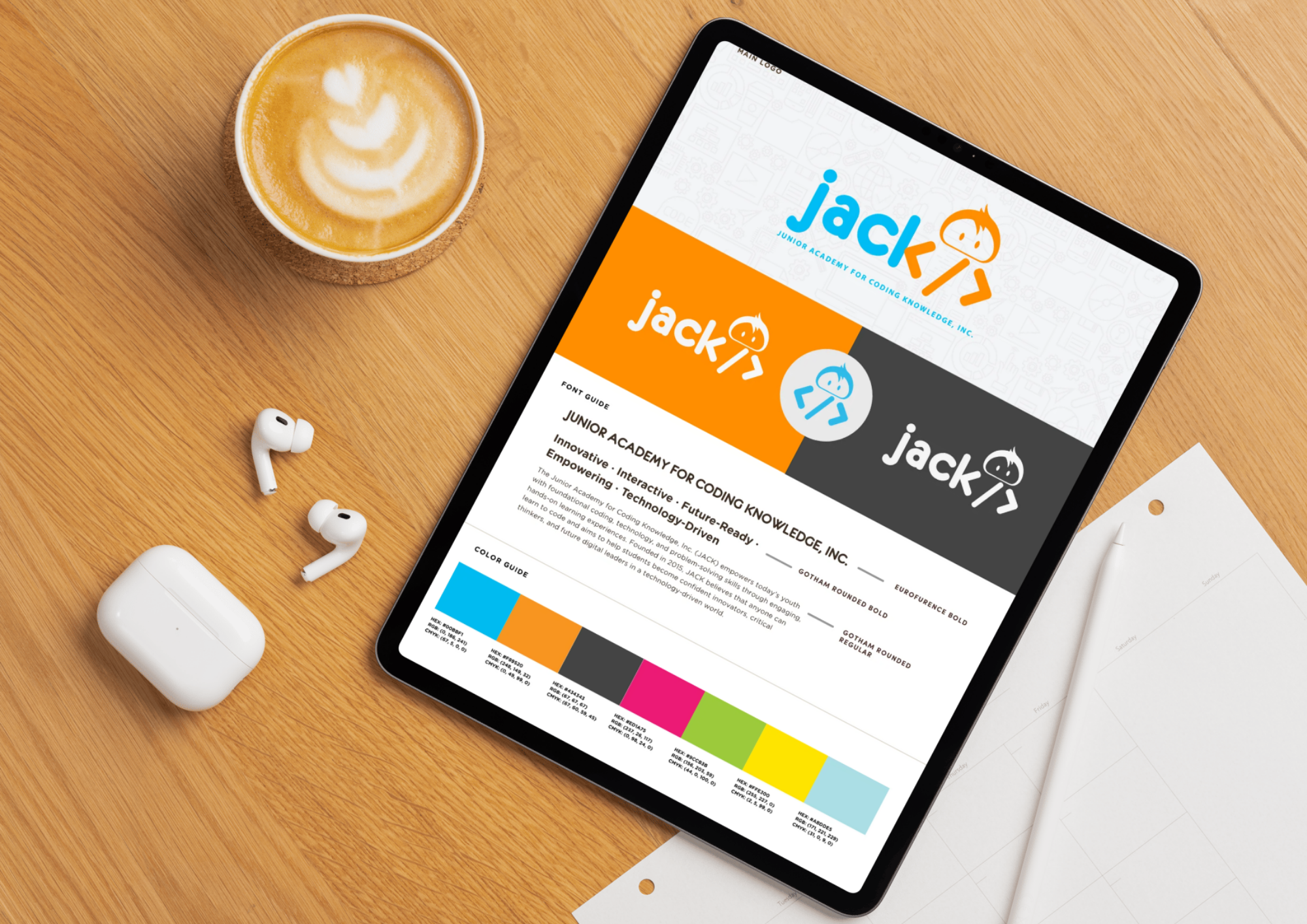
Brand refresh exploration (based on existing identity)
Visual system development
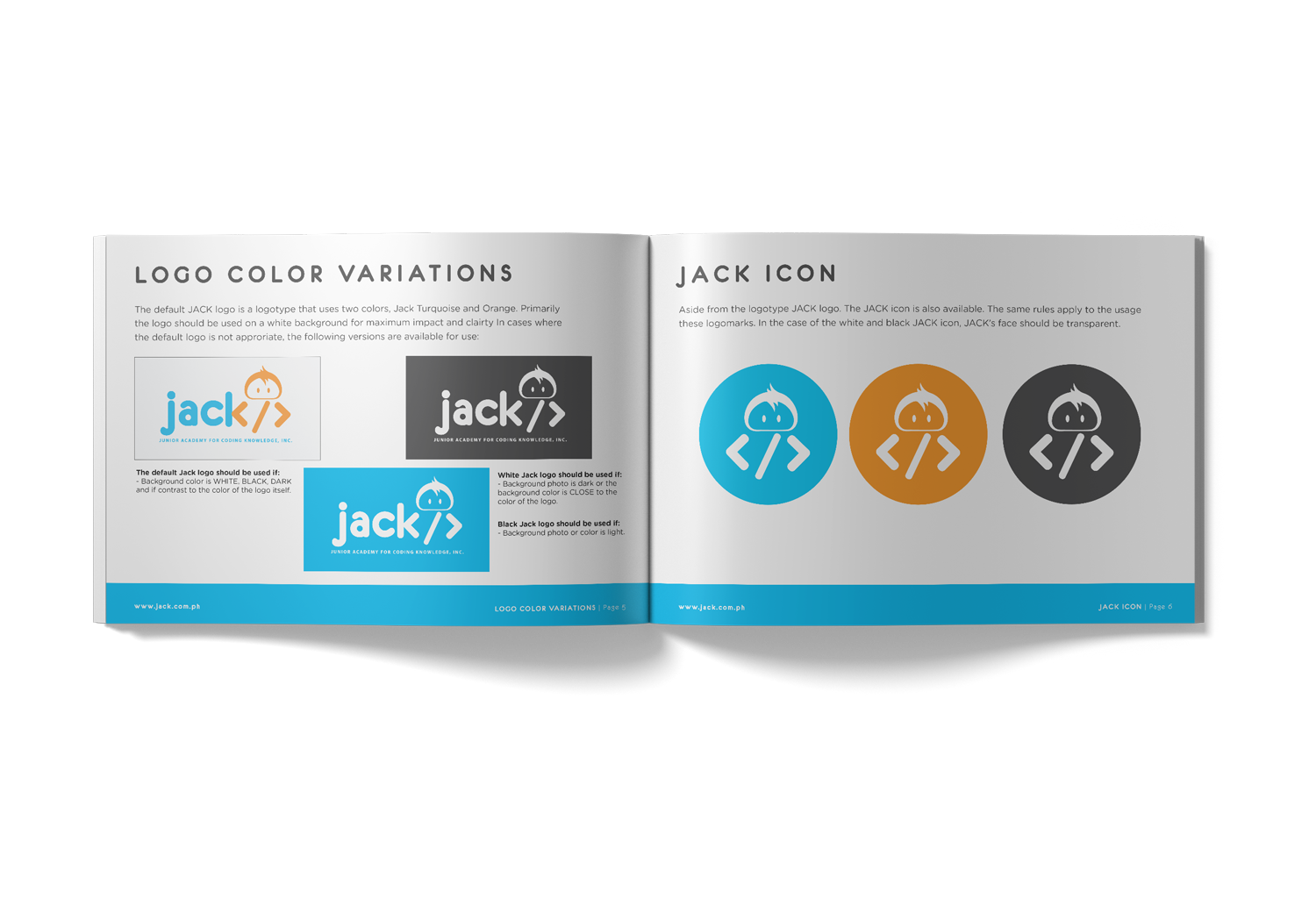
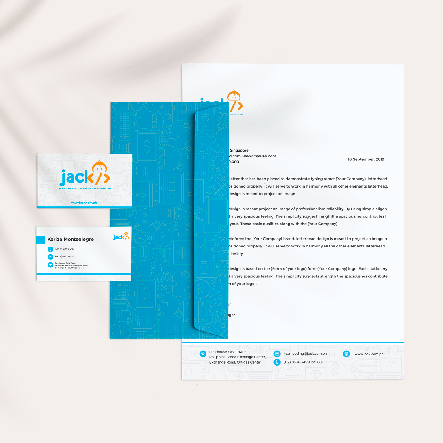
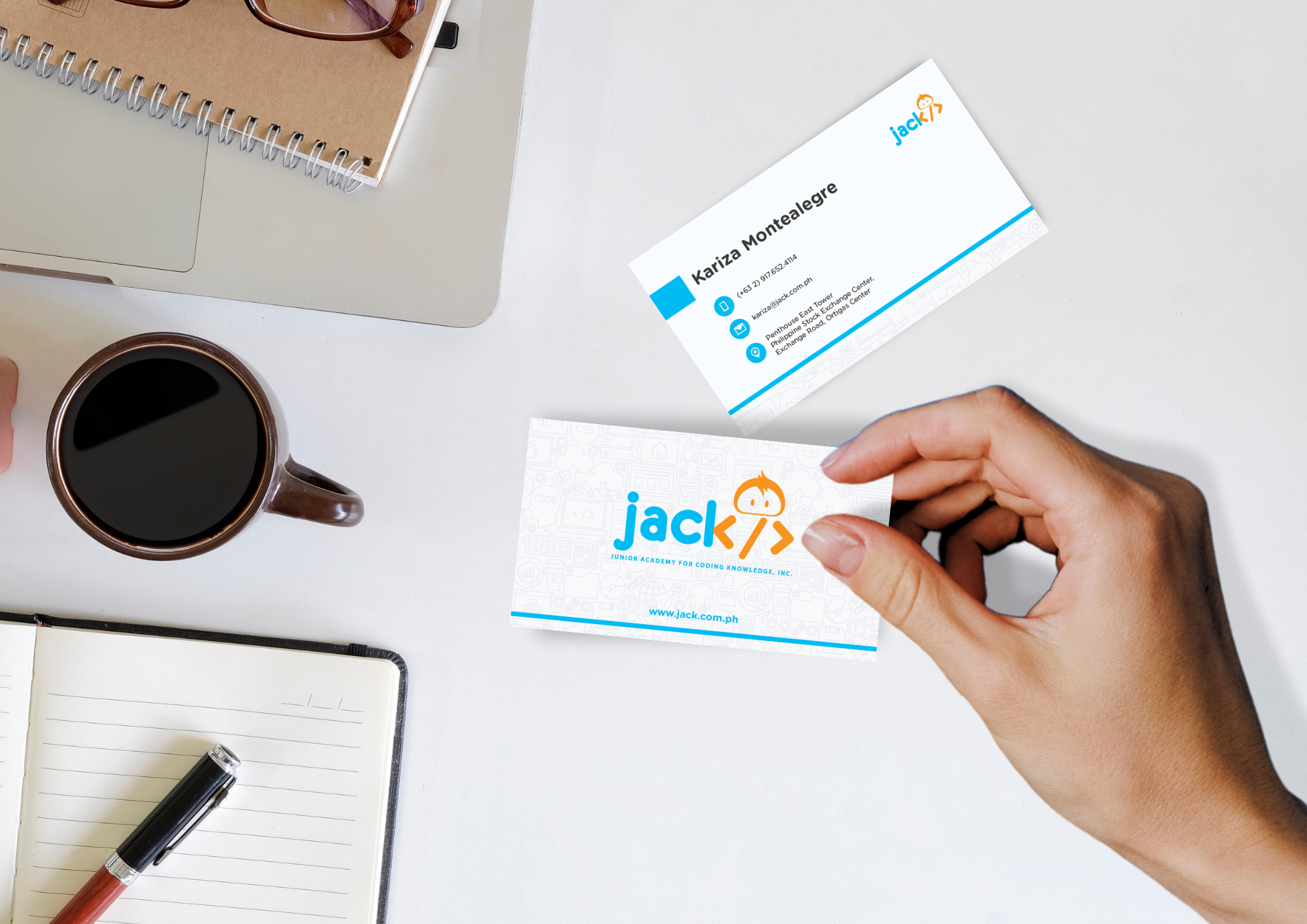
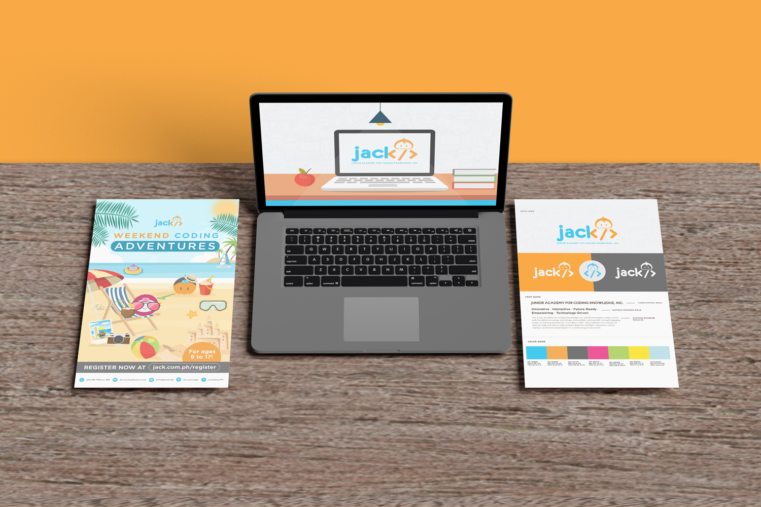
Recreated brand assets for consistency
Brand guidelines for usage and alignment
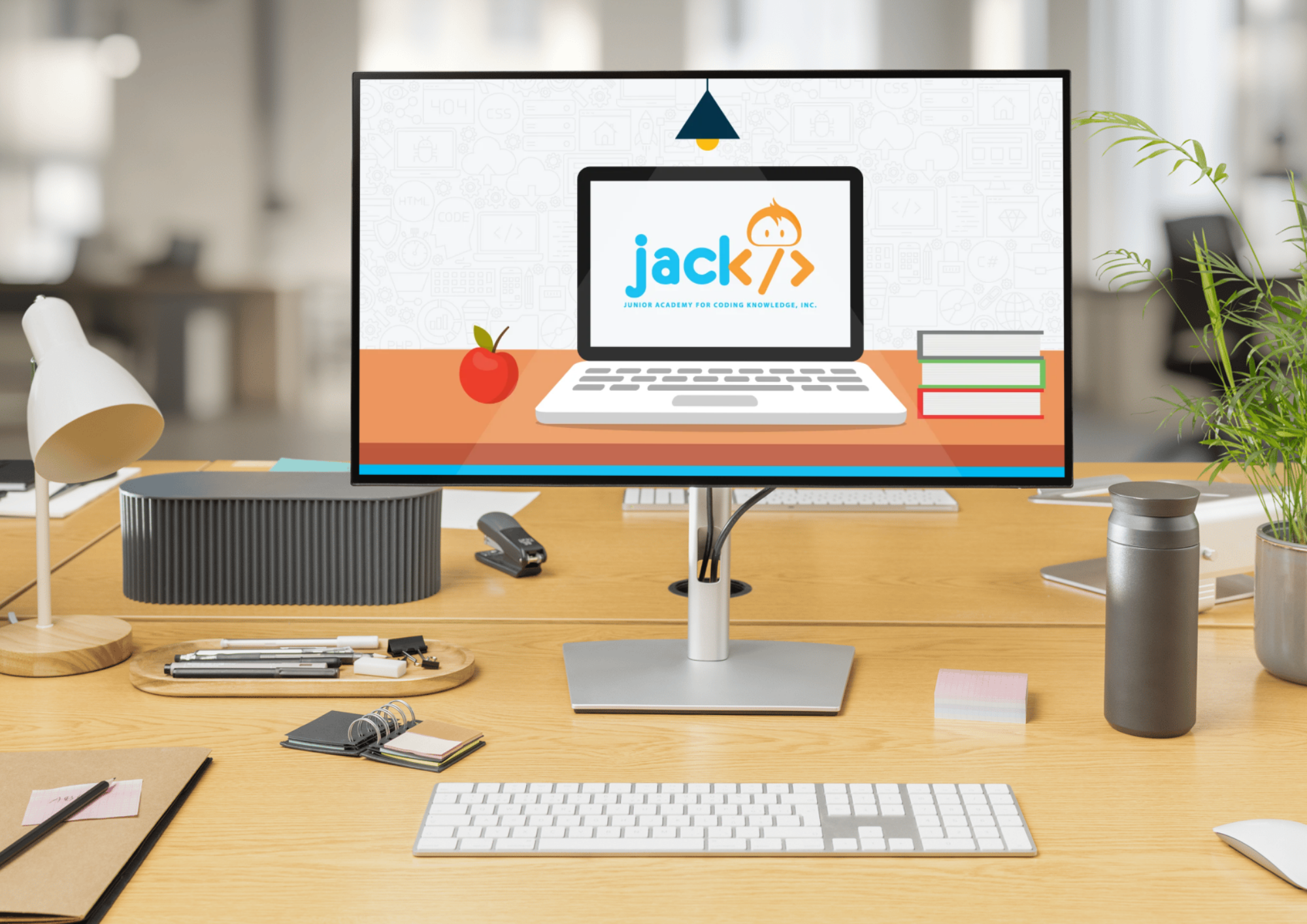
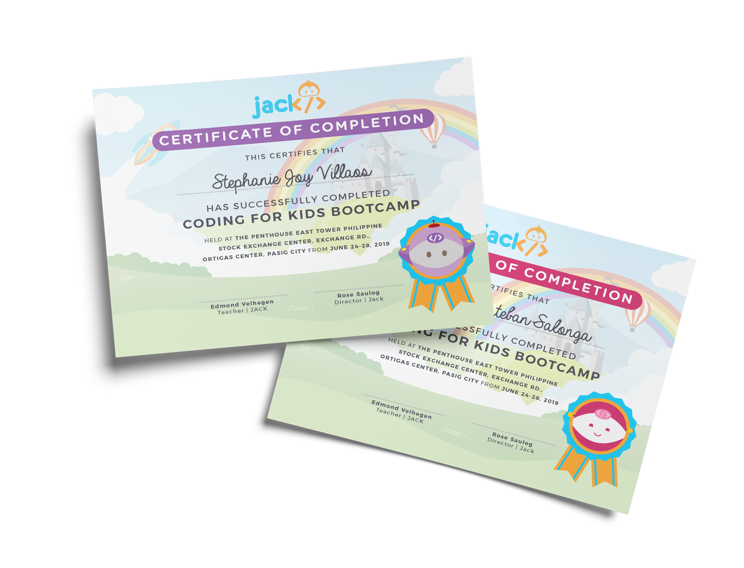
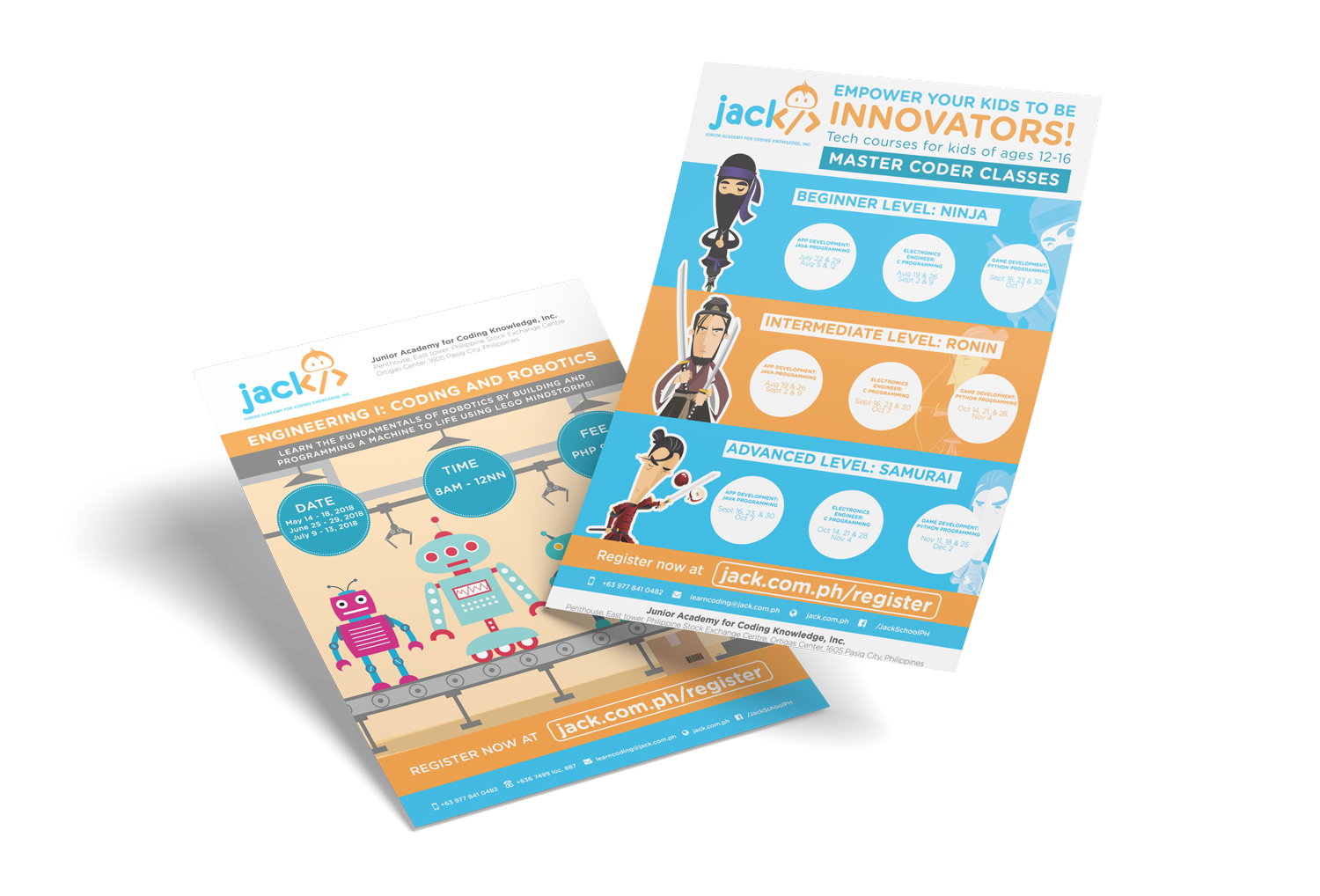
Sample marketing and communication materials

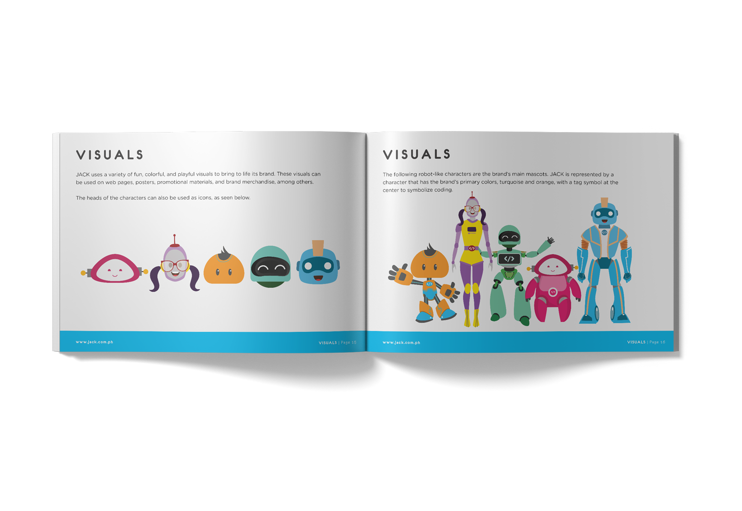
DESIGN DIRECTION
The visual direction focused on balancing education and creativity.
The goal was to maintain the brand’s existing foundation while introducing a more structured and cohesive system. The approach aimed to make the brand feel more engaging for students while still maintaining clarity and usability across different materials.
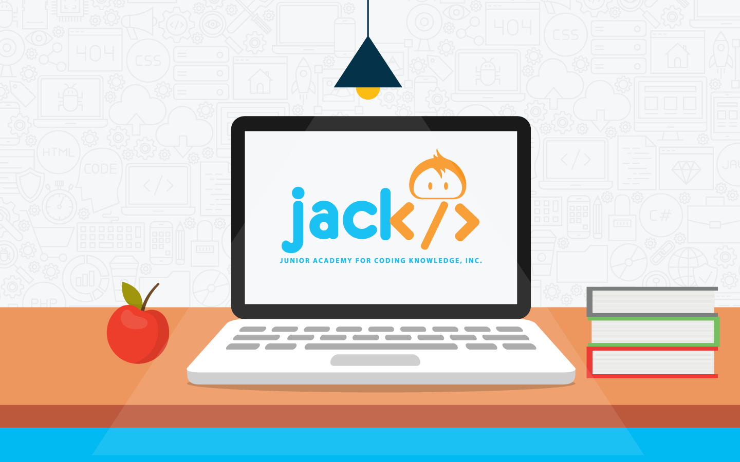
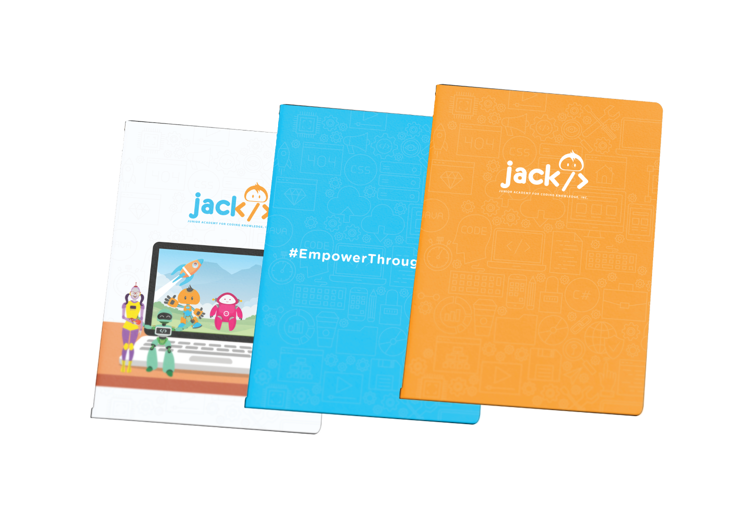
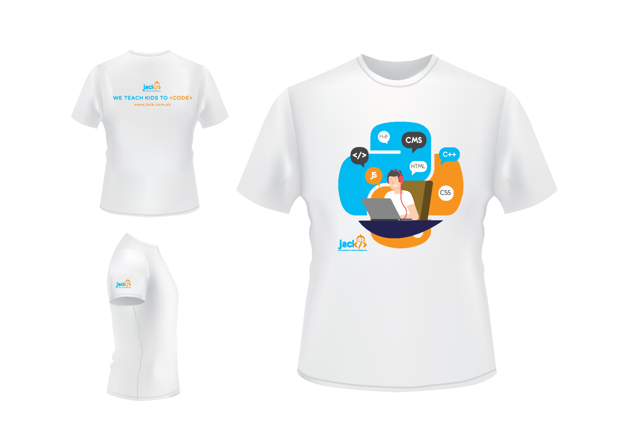
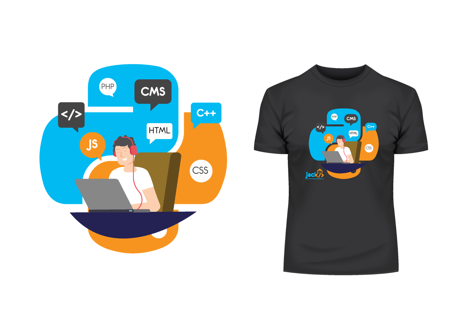
Visual Applications
*
Visual Applications *
PROCESS
The project started by reviewing JACK PH’s existing identity, including its logo, colors, and current materials.
From there, I explored ways to improve consistency and usability by creating a more structured visual system. The refined direction was then applied across sample assets to demonstrate how the brand could scale across different touchpoints.
THE OUTCOME
The result is a more cohesive and structured visual system that better supports JACK PH’s mission as an educational institution.
This study demonstrates how the brand can evolve while maintaining its core identity, providing a stronger foundation for future materials and communication.
Looking to refine your brand with clarity and structure?
View Studio Artisan Sky →
See Previous Works
-
![]()
Terra Tranquila Wellness — Brand Identity, Social Media & Marketing Collateral
-
![]()
ReadyMaid Cleaning Services — Brand Identity, Social Media & Marketing Collaterals
-
![]()
HeyKuya PH — Rebrand & App Experience Redesign